
The Conjuring is a 2013 American supernatural horror film that was directed by James Wan that was produced on a budget of $20 million and made $318 million at the box office.
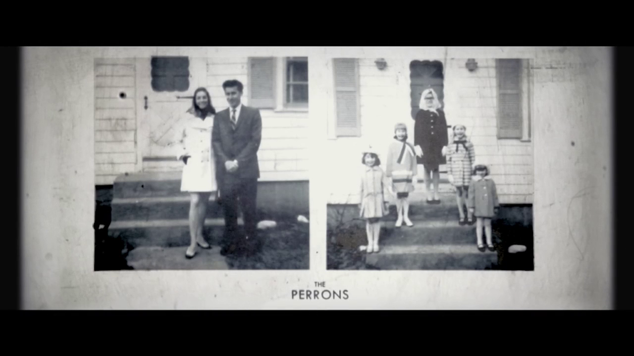
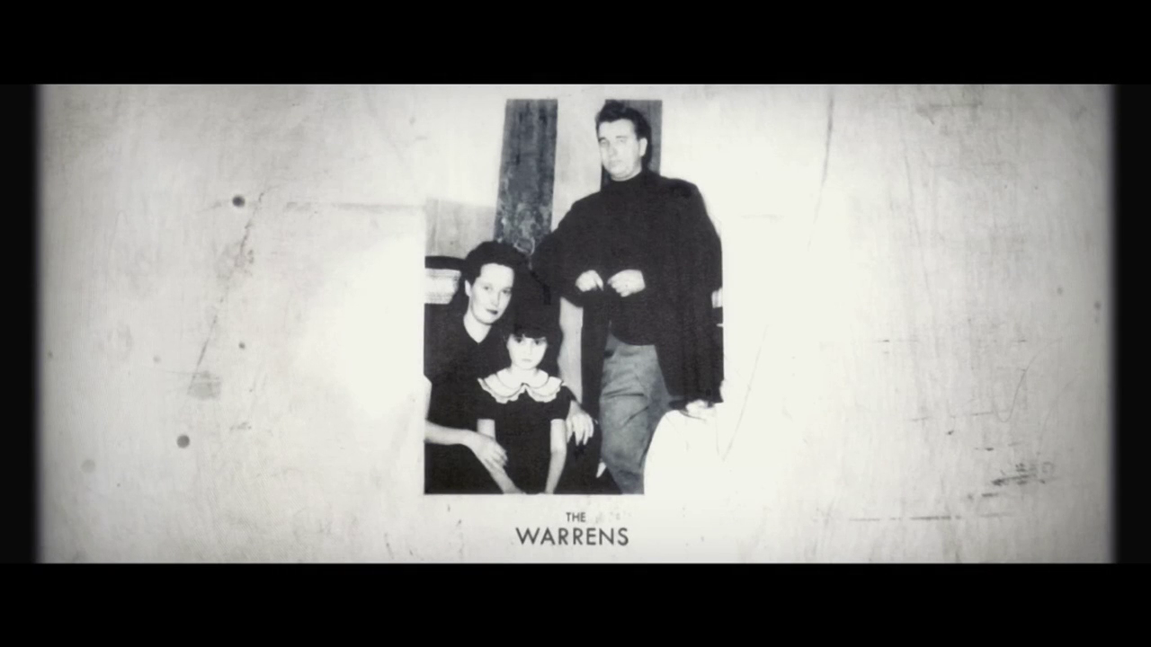
The titles begin by showing the two prominent families that we presume feature in the film itself. These are both shown with fades in and out before the main titles start.
The Director, James Wan’s title fades onto the screen with the visual of a house, and fades to black into the next. The shots that follow are preceded by a live-action shot revealing an overhead projector with transparency film layers.
These titles are added into the scene through the placement of a layer under the projector in an unconventional way.
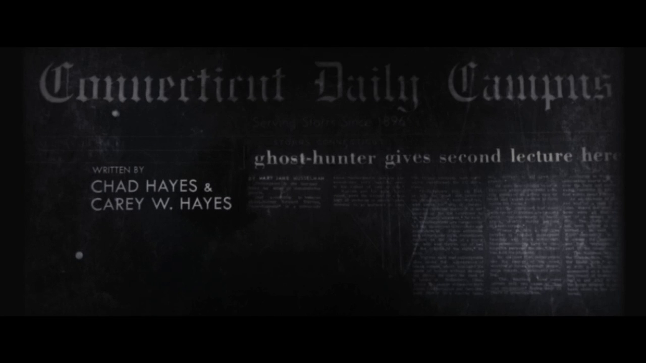
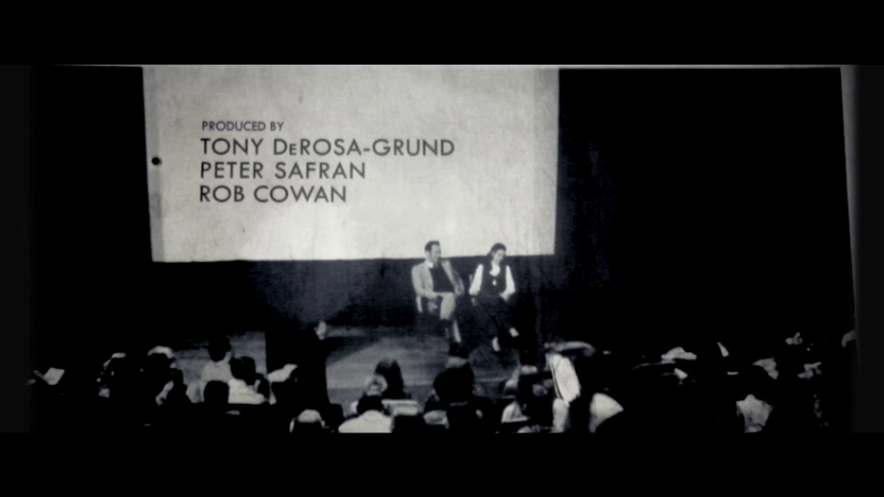
All of the crew and cast titles that follow this follow a similar style - usually with some kind of news article being placed under the projector, or occasionally with the text being revealed by a further layer placed on top.
The final title before the film starts is that of the film, before a closing shot of the overhead projector again and a cut to black.
This title sequences makes use of a Sans Serif font, with the names of those credited in a large typeface than their role in the production. Cast members are sometimes listed through the use of multiple lines that are indented (such as at 01:32) or placed on the next line. The font used contrasts with the serif ‘Times New Roman’ style font of the newspaper background, and appears to be much more modern than it.
Still
|
Start Timecode
|
Text
|
 |
00:01
|
The Perrons
|
 |
00:10
|
The Warrens
|
 |
00:17
|
Directed by James Wan
|
 |
00:27
|
Written by Chad Hayes & Carey W. Hayes
|
 |
00:33
|
Produced by Tony DeRosa-Grund, Peter Safran, Rob Cowan
|
 |
00:39
|
Executive Producers Walter Hamada, Dave Neustadter
|
 |
00:42
|
Director of Photography John R. Leonetti, ASC
|
 |
00:52
|
Production Designer
Julie Berghoff
|
 |
00:58
|
Edited by
Kirk Morri
|
 |
01:04
|
Patrick Wilson
|
 |
01:08
|
Vera Farmiga
|
 |
01:16
|
Ron Livingston
|
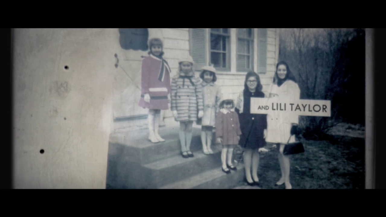 |
01:22
|
and Lili Taylor
|
 |
01:32
|
Joey King, Shanley Caswell, Hayley McFarland, Mackenzie Foy
|
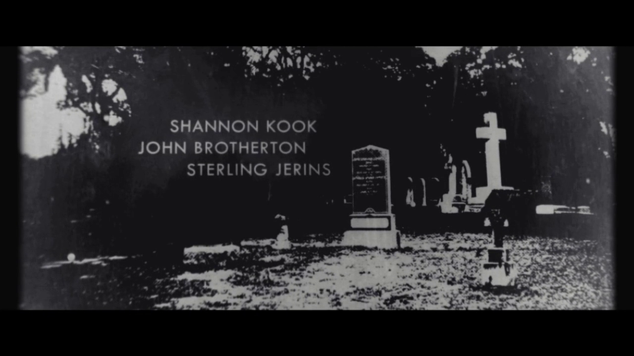 |
01:36
|
Shannon Kook, John Brotherton, Sterling Jerins
|
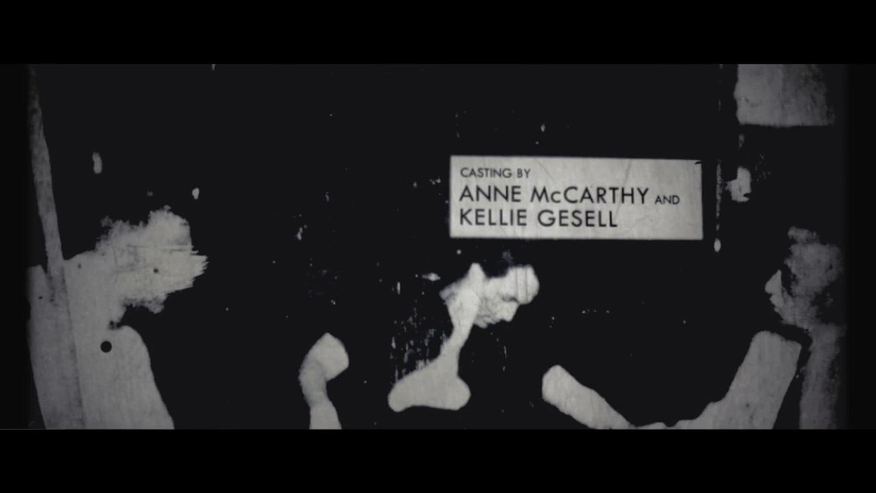 |
01:45
|
Casting by Anne McCarthy and Kellie Gesell
|
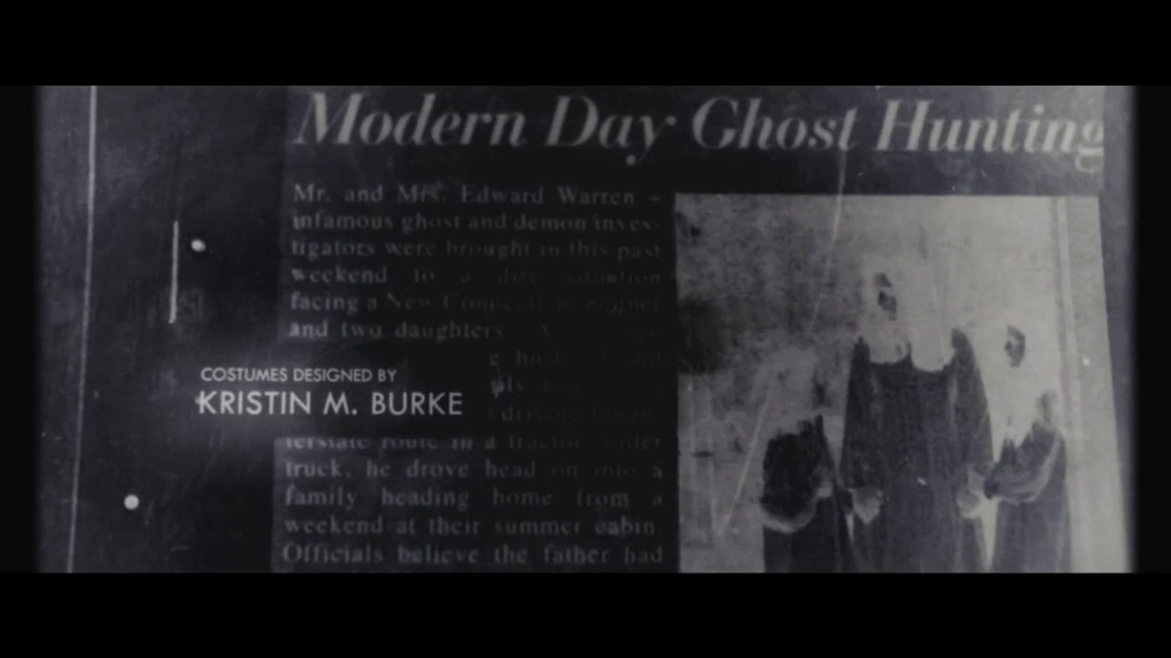 |
01:48
|
Costumes designed by Kristin M. Burke
|
 |
01:57
|
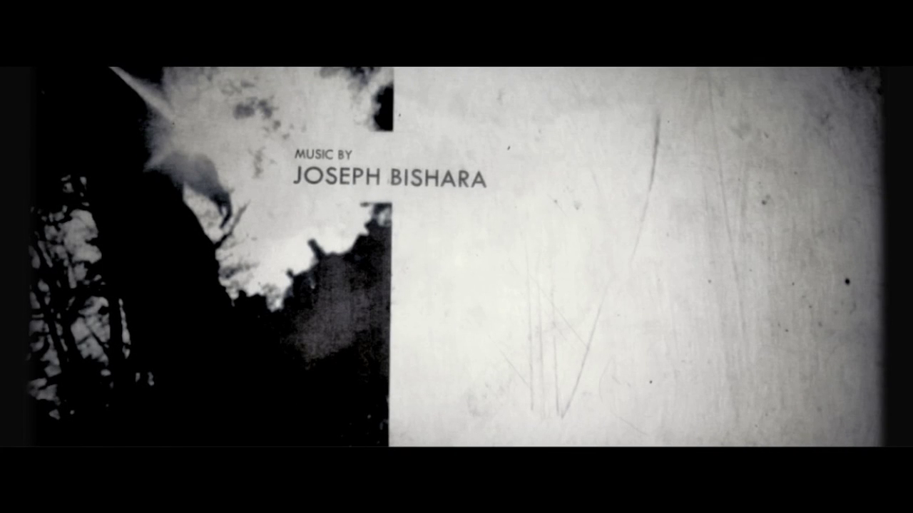
Music by Joseph Bishara
|
 |
02:01
|
A New Line Cinema presentation
|
 |
02:09
|
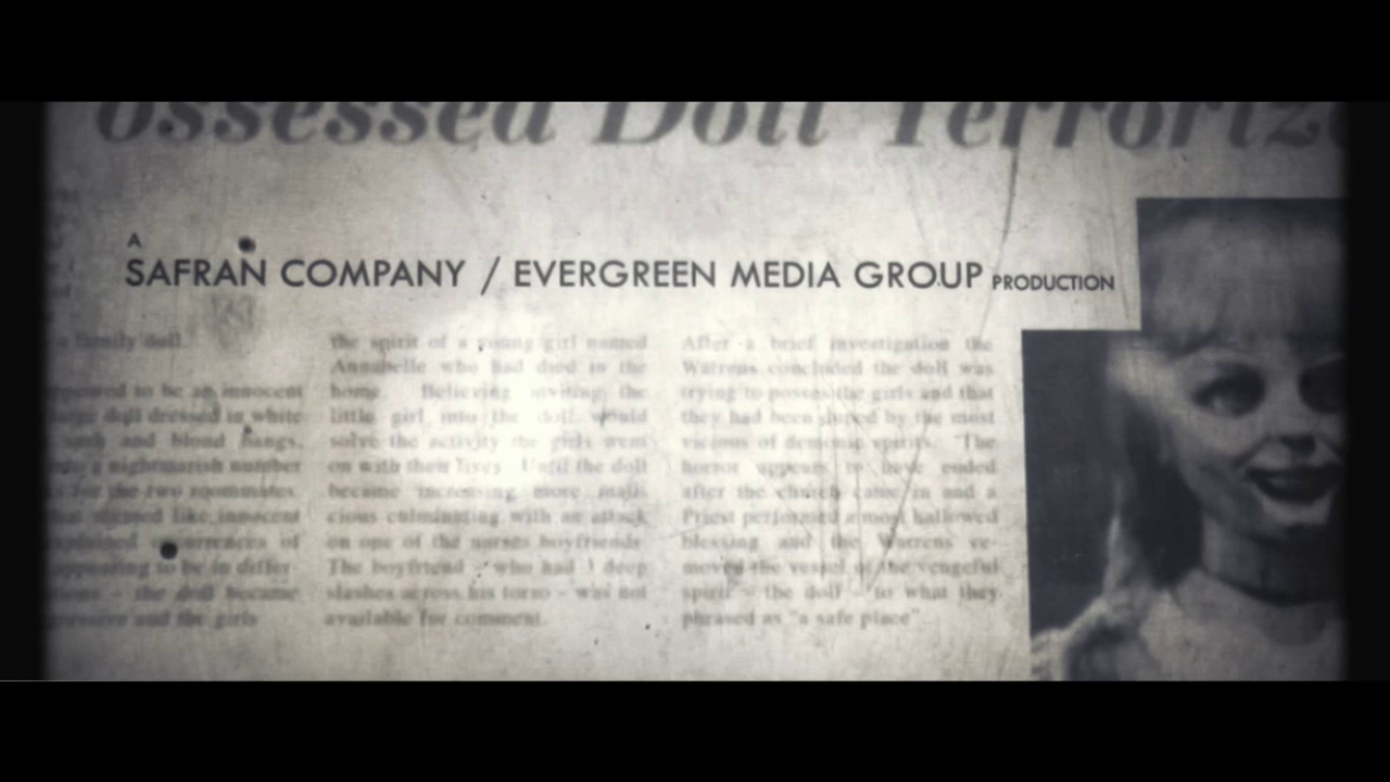
A Safran Company / Evergreen Media Group production
|
 |
02:14
|
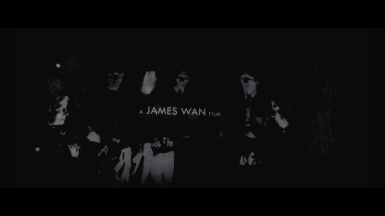
A James Wan film
|
 |
02:19
|
The Conjuring
|
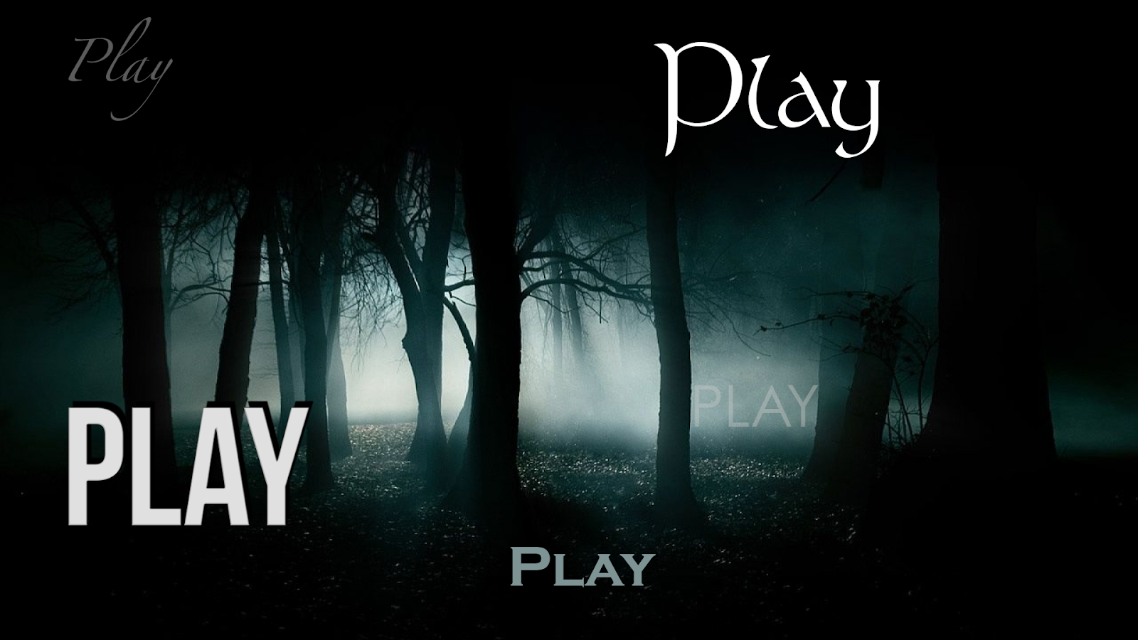
I used Adobe Photoshop CC 2015 to create some simple title mock-ups based on our short film, PLAY.
I decided to try multiple styles that convey different moods - with some sans serif, and some serif fonts.
The fonts that appear more handwritten (such as that in the ‘Stonehenge’ - top right and ‘Copperplate Gothic’ - centre bottom) fit the horror genre better than the bolder text (such as ‘Bebas Neue’ - bottom left)
--
Video Credits:
Client: Warner Bros., New Line Cinema, Evergreen Media Group, The Safran Company
Director: James Wan
Live Action Direction, Design, Animation, Compositing, VFX, Production: Aaron Becker
Additional Design & Animation: Matthew Darnell
Additional Research: Richard Kroll
Produced By: Becker Design
-
Background image (text design): © HDWALLPAPERSNEW.NET
Excellent work Jon, great post in terms of comment and visual evidence. there could be some comment on what is institutionally conventional in term sof the order of title and also something about hierarchy of font size and positioning on the page, but well done
ReplyDelete