
Jordskott Opening- Title Analysis
Order of Appearance:
- Production and production assistants [4 seconds]
- Cast [5 seconds]
- Scriptwriters [5 seconds]
- Director of photography and production designer [3 seconds]
- Costume and makeup [3 seconds]
- Editor and sound design [3 seconds]
- Producer and Director [4 seconds]
- Concept creator [5 seconds]
Significant design elements:
- Typeface - Sans serif
- Rectangular typeface with the exception of title
- Notable casts’ names in white against burgundy blood spatter
- Script writers’ names embedded in bottom left third amongst series of photos
- Makeup and costume in left third of shot alongside x ray
- Editor, scorers and sound design surrounded by hand drawn illustrations in lower left
- Set design and producer in top right amongst news articles
- Title “Jordskott” is central in a serif font with roots growing from it
- Traditional typeface symbolic of Viking influence

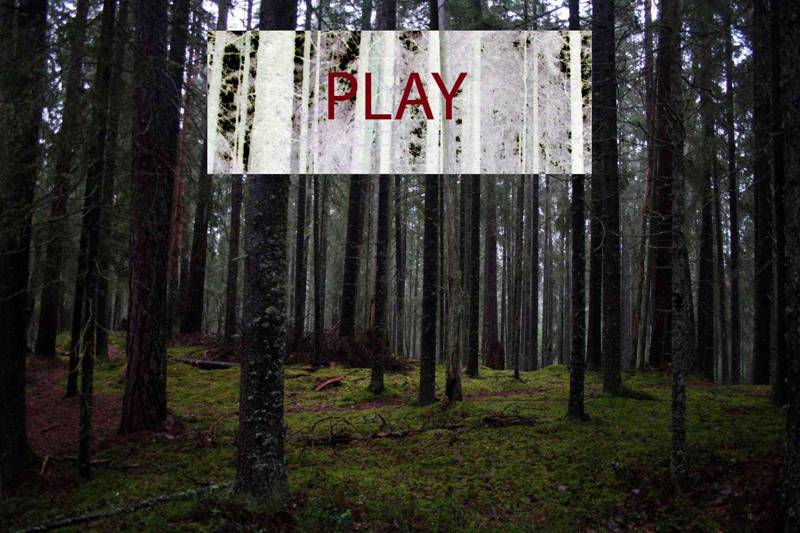
In response to my research I have edited a picture found on the internet to emulate the Scandinavian crime drama setting and have used it to create a potential title sequence for our horror opening "PLAY". The negative section helped create the blood red text in a very static sans serif typeface. As well as this the negative panel breaks up the picture and has a paranormal connotations.
well done Dylan, interesting choice of film and great production idea
ReplyDelete